In collaboration with Florida International University, students build a portfolio at Miami Ad School and earn a master's degree from Florida International University.
Learn new skills to advance your career while building your professional network. Graduate with a recognized MAS certificate of completion. Not COE accredited.
Gain the edge to go from doer to leader. Learn from established industry leaders and leave with a certificate of completion. Prior experience required. Not COE accredited.
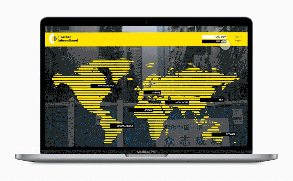
“This project consists of the branding and brand identity for Courrier International, a weekly French newspaper that translates and publishes excerpts of articles from more than 900 international newspapers.
In homage to the typographic work of Paul Rand, the logo uses simple geometric shapes to represent an open mind that is curious about the world. Together, the two shapes draw the newspaper’s initials CI. The sans serif typeface, Century Gothic, adds to the modernity and simplicity of the logo.”